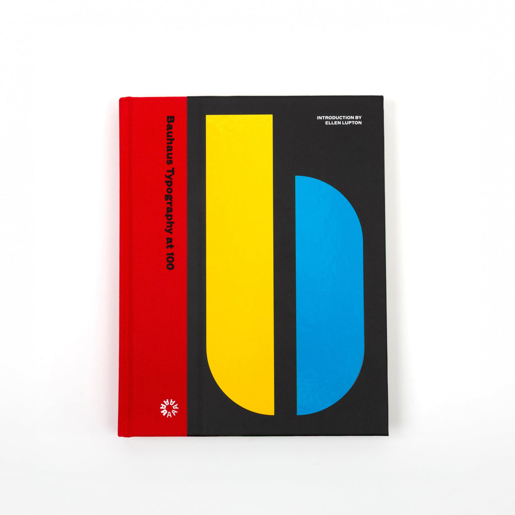
Bauhaus Typography at 100
$45.00
An unprecedented look at the school’s typography and print design, from its early expressive tendencies to the functional modernism for which it is famed today.
Known for its bold sans-serif typefaces, crisp asymmetrical grids and clean use of negative space, the Bauhaus emerged as the forebearer of a new look—one that seized the tools of mass production in the creation of a radical new art. Today, just over 100 years after the Bauhaus’s opening in 1919, the school’s visual hallmarks have come to define modernity as it appears on the printed page.
Author(s): Ellen Lupton, Rob Saunders
Hardcover, 276 pages, 7.5" x 1.1" x 9.5"